How David Hockney Trolled the ‘New Yorker’
His latest cover art set off a (small, cozy) firestorm.

The New Yorker has released a preview of the magazine’s second-to-last cover of 2020. The cover features an original digital painting by David Hockney, titled “Hearth.” It depicts a fireplace and is decidedly juvenile in execution. The brushwork appears childish and has sparked a Twitter backlash and outcry.
“This is very funny. Hockney is perfectly capable of using digital brushes properly, can only assume he hates someone in the TNY art dept,” Jo Livingstone of the New Republic noted in now-deleted tweets, “Either that or somebody at TNY doesn’t care enough to protect his legacy.” Livingstone pointed to a number of Hockney’s recently exhibited digital paintings as evidence of his mastery, supporting the supposition that the New Yorker cover might be, in some way, a troll.
Along with the cover in question is a brief synopsis and Q&A with Hockney conducted by Françoise Mouly, the New Yorker’s art director. In it we learn that Hockney, after doing 220 digital paintings in 2020, will be returning to oils for a large mural in 2021. While not a sweeping or in-depth discussion of his work, the interview touches on his now decade-long fascination with the iPad as an artistic device and his taking inspiration from tapestries. The piece also features a time-lapse of the digital painting being created.
If anything, the interview raises more questions than it answers. Why, if Hockney went to such great pains over the course of the year to produce this great and specific quantity of work, did Mouly not choose to elevate one of better quality? “For these short, dark days,” she writes, “David Hockney offers the traditional comfort of a hearth.”
Hockney is 83 years old and considered among the greatest living British artists for his contributions to the pop art movement in the 1960s. Over the course of his career, he has used a wide range of media and has not shied away from technology.
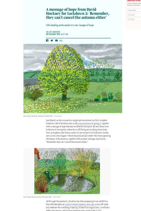
But “Hearth” simply does not justly represent Hockney’s digital work. Just last month The Art Newspaper featured an item on his digital art in quarantine, highlighting the hope that his most recent work is capable of eliciting.
The Art Newspaper featured two digital paintings in particular, first “The Big Tree in Autumn,” has a remarkable sky--blue in the center of the frame, breaking through the clouds behind the branches of the tree. There are layers of gray in the clouds. The details of the tree’s branches and leaves show deliberate use of different textures and opacities. These are advanced techniques regardless of medium.
“The Pond in Autumn,” made two days later, is even more impressive. Again the range of detail, color, texture, and gesture, while not entirely controlled or pristine, still shows the hand of a skilled and dedicated artist. The tranquility of the water Hockney is able to portray is masterful.
Given the well-honed skill and style evident in these works and others exhibited over the years, why the New Yorker chose or accepted upon commission such a seemingly anomalous painting is a valid question. Hockney is clearly in command of his faculties, making it seem all the more likely that the irreverence and slap-dash nature of “Hearth” are an intentional thumbing of the nose at the magazine’s grandiosity.
This is also not the first iPad sketch from Hockney that has graced the New Yorker’s cover. The three previous digitally produced Hockney covers featured beneath the interview—still lifes from 2010 and 2011 and a landscape from 2018—are all vastly more complex and impressive. It is not just that the study of the fireplace is weak or a departure from the other iPad work he has done at large—it is a departure in quality from what he has submitted in the past to this same magazine and this same art director.
Responding to Livingstone’s critique, Sterling Crispin suggested that “Hearth” was in continuity with Hockney’s previous digital work:
“But that’s part of the appeal, hard for people to understand it’s supposed to be sort of shitty,” Crispin continued.
Given, again, Hockney’s stated mission to complete 220 paintings in 2020, it’s safe to say we can’t expect all of them to be bangers. So yes, some are going to have that “intentional shitty crude” quality to them—that is not the surprise. The “surprise” is that he chose to shoddily iPad it in for the cover of one of the most prestigious magazines in the world after a year of social uprisings calling for the cultural standard bearers to be more inclusive in who and what they chose to promote. At a moment when art, almost alone among human endeavors, can offer us beauty and inspiration, or solace and consolation, or distraction and humor, or any other variety of grace, Hockney and the New Yorker give us this?
Kyle Chayka—using a logical fallacy to bait the conversation away from ‘why or why not the painting is shitty and why was it chosen’ to ‘well actually, it is a virtue that the painting is shitty’—chimed in with this bit of wisdom: “making people mad is a great side-effect of art.” It can be, yes. It is also the intended effect of trolling.
Chayka goes on to invoke a well-known anecdote of dubious origin:
It always reminds me of the story about the woman who approached Picasso in a restaurant, asked him to scribble something on a napkin, and said she would be happy to pay whatever he felt it was worth. Picasso complied and then said, “That will be $10,000.”
“But you did that in thirty seconds,” the astonished woman replied.
“No,” Picasso said. “It has taken me forty years to do that.” This vignette does not contradict Livingstone’s point, though. Dashing off a scribble for someone seeking, and willing to pay for, the work of a master is inherently an act of “trolling”: an instance of behaving provocatively or antagonizing someone. The crux is the irreverence and the New Yorker’s acceptance and elevation of it.
Suggesting that the iPad’s paint app is “unforgiving” is an insult to Hockney, who has demonstrated that he is perfectly capable of producing very fine work in the medium. It is not difficult to grasp that some media are cruder than others. That is not what is at issue here.
Chayka’s and Crispin’s defenses of the cover are silly. To suggest that there is something shallow or misinformed in taking umbrage at the cover’s juvenile quality is simply pretentious. This is not a case of “my kid could do that” but a moment to reflect on editorial integrity (and the possible virtues of ‘shitposting’). Because ultimately an editor made the choice to feature that image in all its mediocrity—choosing to capstone the year by having an old white man dash off an image severely lacking in technical qualities and at odds with his proven abilities and reputation.
Even so, there is something pleasurable about seeing something done so terribly appear on the cover of the New Yorker. The disjunction is genuinely hilarious. Some have gone so far as to call it “iconic.” By being elevated to the cover it is able to capture a bit of the 2020 zeitgeist. This is not enough to redeem the digital painting as a standalone work of art. A fittingly shitty end to a shitty year.
“Abstraction is still difficult for people!!!” Chakya exclaims. Indeed, it seems at least some of the meta aspects of trolling have gone over quite a few heads. But saying a work is purposefully bad doesn’t make it good.


