

Kamala Harris's Logo Is a Disaster. Here's Why.
Does bad graphic design doom good candidates? Or do lousy candidates inspire bad graphic design?

Back in 2016, I was pretty bullish on Marco Rubio’s presidential prospects—right up until the moment I saw this:
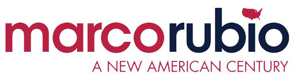
The candidate’s name in lower case? The letters all running together like one word? The CONUS map as the dot on the “i”?
Yeah, bro. Graphic design is my passion.
Look, I’m not saying that graphic design wins presidential primaries. But minimally-competent graphic design is highly correlative with success.
Which brings us to Kamala Harris.
On paper, Harris, like Rubio, looks pretty formidable. And like Rubio, she has rolled out her campaign with a dumpster-fire logo. Seriously: It might be the worst political graphic design job in a generation:
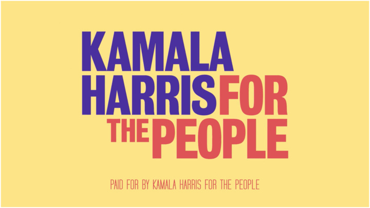
So, you know, there goes that campaign.
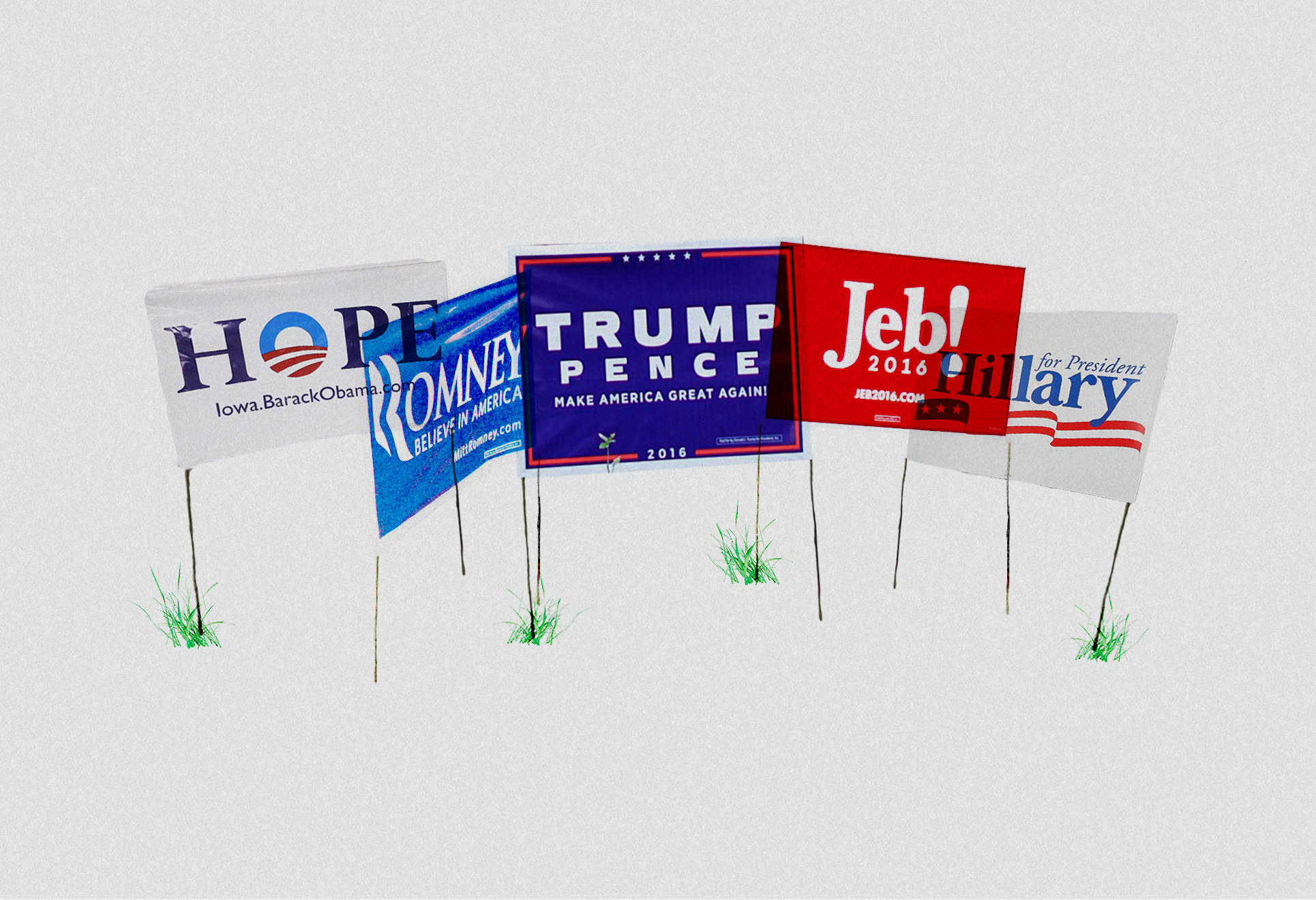
If you came of age during the ’70s, ’80s, or ’90s, you probably viewed the graphic design for campaign logos with a fair amount of disdain. Because they all pretty much looked like this:
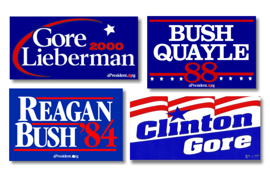
Are you sensing a theme? Take Pantone’s “Ribbon Red” and “Royal Blue,” add a clip-art element, and presto! You’re running for leader of the free world.
Everything changed in 2008 when Sol Sender designed a logo for Barack Obama that will probably go down as the most important piece of political graphic design in the last century. And I’ll bet the milk-money you remember it:
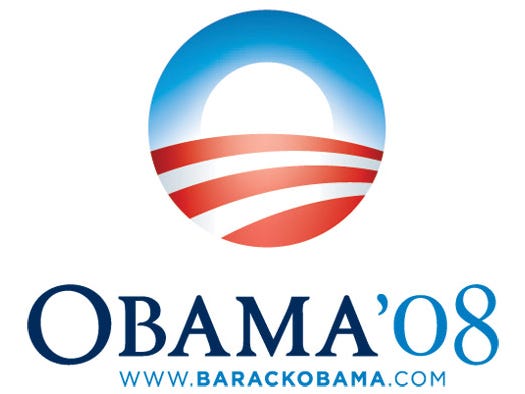
Why is the Obama logo so great? Let us count the ways:
It subverts your color expectations by using a warm, engaging pale blue.
It conveys two types of motion: (1) The red road arching ahead into the distance moves your eye along the z-axis while, (2) The haze on the blue “O” gives the sense rising along the y-axis.
It gives you pleasing, perfect symmetry: The circular “O” on top with the “Obama ‘08” tag on the bottom framed by the overhanging “O” and “8.”
It can be used anywhere: On hats, yard signs, bumper stickers, pins—you could even substitute the logo for the “O” (or the design elements) in any word you wanted to mate to the campaign. For instance:
This logo is nothing short of genius and its power broke 40 years of design gridlock.
What makes a good logo for a political campaign? As Robert Bresson notes, there are "Ten properties of a subject, according to Leonardo: light and dark, color and substance, form and position, distance and nearness, movement and stillness." Maybe it’s not rocket science. But if it was easy, everyone would get it right. And it's only when you master the unity of those elements that you get to genius.
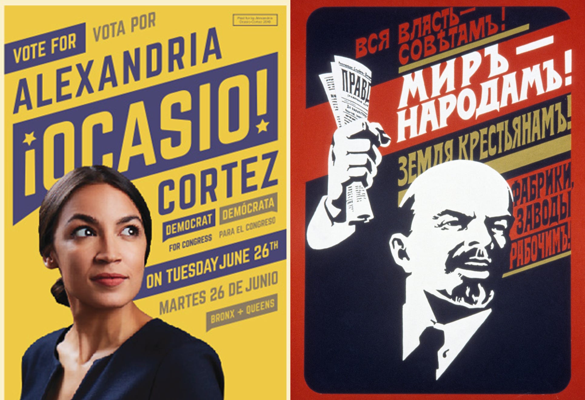
Keep those precepts in mind when you look at campaign designs that work. Like, for instance, Alexandria Ocasio-Cortez’s fantastic poster, which was probably responsible for 5 points on Election Day all by itself:
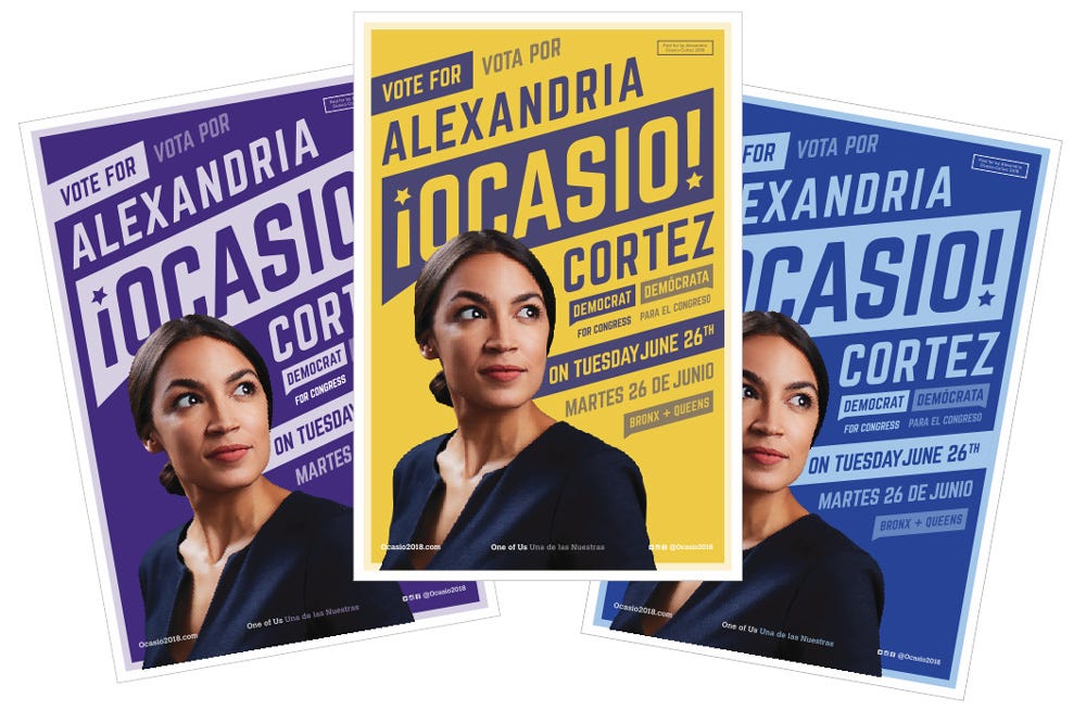
This design gives the viewer a deluge of information. For starters, it shows the candidate—which is key when your candidate is as attractive as AOC. And she’s not grinning or smiling—she’s looking off-page, into the future. Her expression is both a promise and a challenge. The entire composition is crackling with energy, from the big, blocky fonts to the tilt on the text, which follows the exact same line-of-sight as AOC’s eyes.
And then there’s something else about it that that hints at revolution and power and “The People” and if you’re under a certain age you might not be able to put your finger on it but—oh hey there!
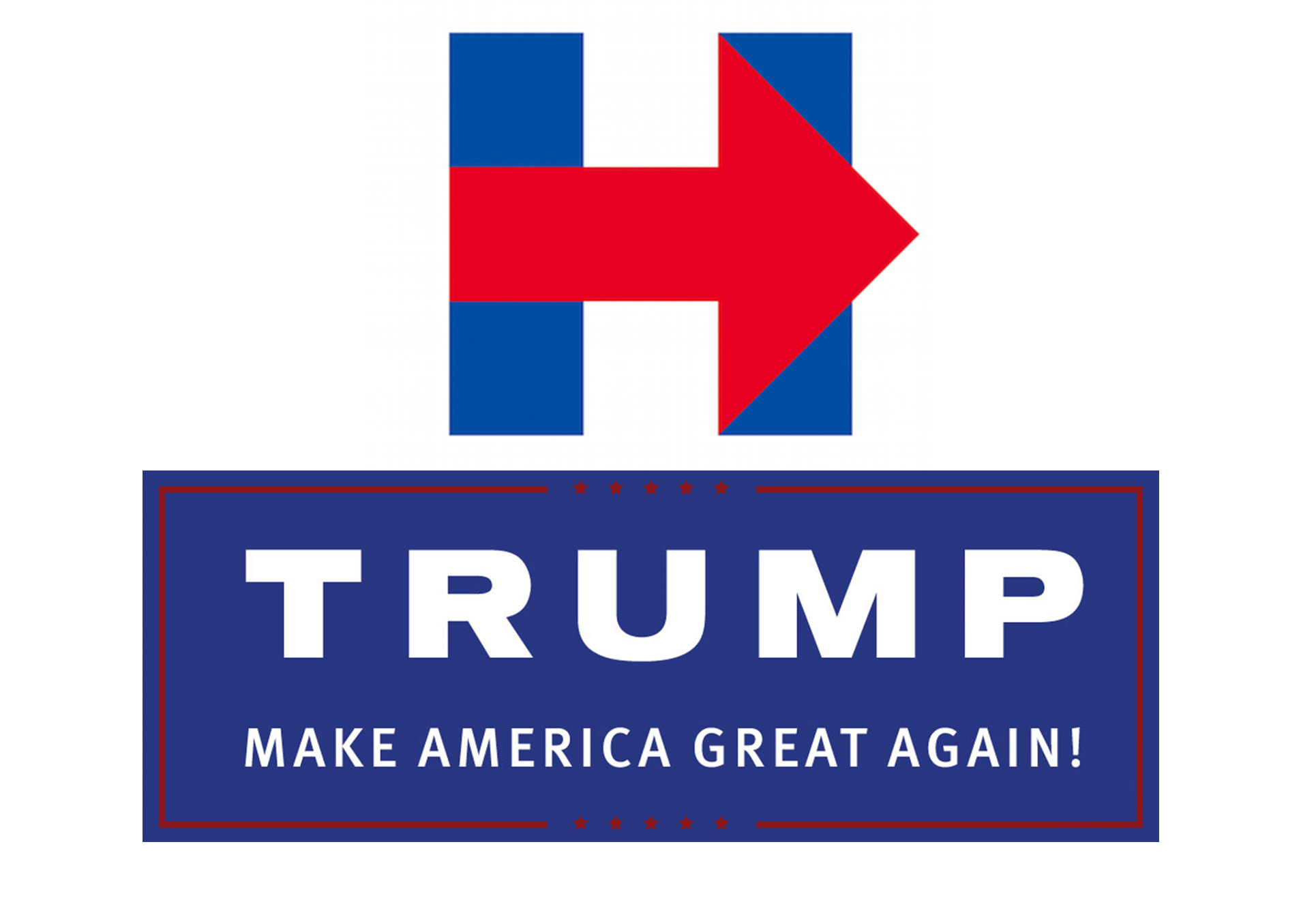
In 2016, both Hillary Clinton and Donald Trump had passable mainstay designs. Clinton was trying to call-back to the Obama logo while also establishing herself as a distinct brand, pointing forward. Trump’s logo was simple, but stable with solid font choices and so much tracking between the letters that you almost get the sensation of motion, as if the word “Trump” was slowly expanding horizontally. Ignoring the later messy iterations, Trump’s key bumper sticker and yard sign iconography was a stand-out success over his primary opposition.
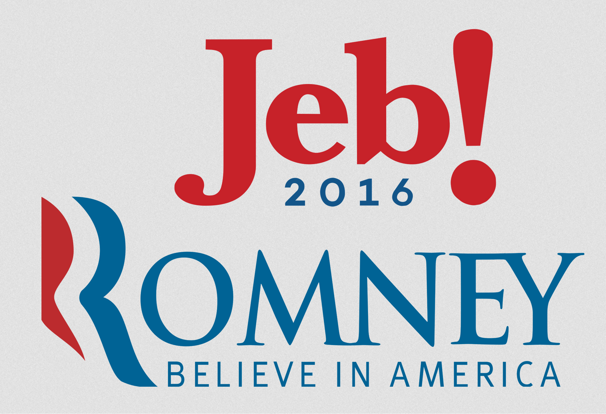
“Kamala Harris for the People” has none of any of that. In the recent history of logo design disasters, it’s right up there with the R-R-Romney 2012 and Jeb! 2016. You look at it and can’t understand (1) How the designer came up with it, or (2) How the candidate accepted it.
On the other hand, maybe you can understand. Because graphic designers are subject to the same trend-think as every other creative class. (Just have a look at some recent brand logo conversions.)
It could be that Harris’s design team looked at the AOC poster and saw the earth-tones, heavy-text, and adjacent colors and thought that that was the secret of their success. And about those earth tones—they’re straight out of the 1970s and they’re a bad idea.
Pantone describes the ’70s palette consisting of “Harvest Gold” and “Rust.” In the 1970s, designers used these colors because they wanted to take viewers “back down to earth—solid, earthy colors to ground us during shakey economic times.” The problem is that when you use those colors today, you remind people of the 1970s and what an unholy mess that decade was. Why would you do that?
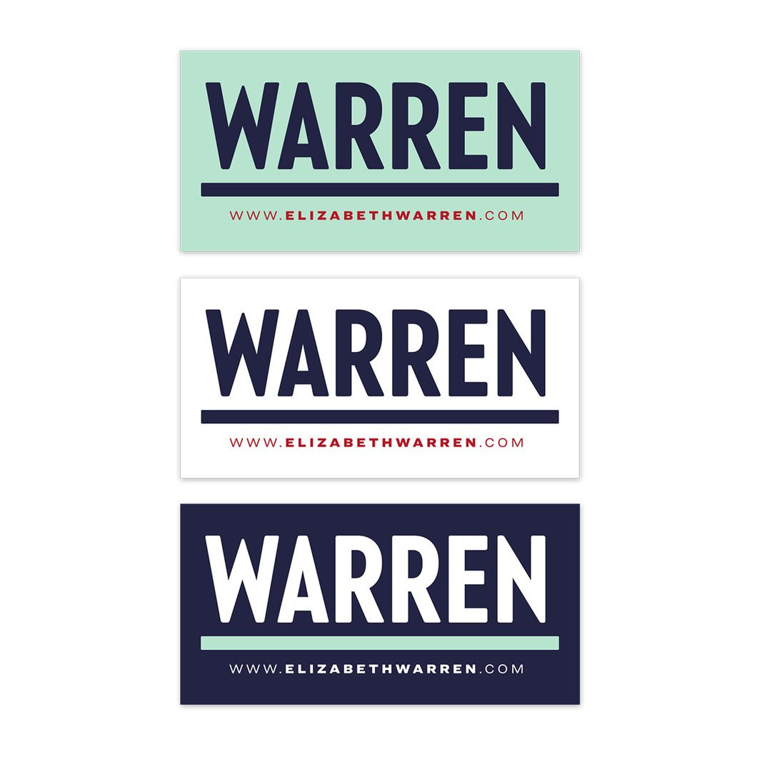
It’s enough to make Elizabeth Warren’s ultra-conventional, super-stripped down sans-serif logo look like a roaring success:
But then again, maybe you can’t blame the designers. I’ve always suspected that, through some crazy cosmic justice, candidates wind up with the graphic design they deserve—that the logo is, in some philosophically meaningful way, a reflection of the candidate.
And if that's really the case, then it’s not too early for Democrats to start worrying.