SINCE AT LEAST THE CLINTON YEARS—which saw the first Republican House majority since the 1950s, the advent of Fox News, the rise and fall of Newt Gingrich, two government shutdowns, impeachment proceedings, and then a contested presidential election in Bush v. Gore—political scientists and public commentators have been fascinated and made anxious by the phenomenon of renewed polarization. That decade, Americans began more rigorously sorting themselves into one of two camps, and those camps started getting crazier; Bill Bishop’s 2008 book The Big Sort explained the first part of this, and Cass Sunstein’s 2009 book Going to Extremes the second. But sophisticated explanations have apparently done little to slow or stop the process, and intuitive solutions—trying to get out of social media bubbles, for instance—may actually make polarization worse. For many, the rise of Donald Trump was the apotheosis of contemporary polarization: Here was a man who would take his party to extreme places fueled solely by hatred of the other side.
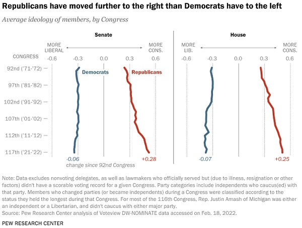
Trump’s presence and influence has surely also galvanized interest in a view that ascribes a lopsided character to recent American political polarization. The claim advanced by proponents of the “asymmetric polarization thesis” is simple: Republicans are the ones who are polarizing; Democrats aren’t. And few tools are as powerful in the asymmetricist’s arsenal as a single graph that has made it into several Pew Research articles and was recently promoted again by Conrad Hackett, Pew’s senior demographer and associate director of research. The graph purports to show that, on a scale of -1 (“most liberal”) to 1 (“most conservative”), the average Democrat in Congress fifty years ago was a -.31 and now is a -.38, while the average Republican in Congress fifty years ago was a .25 and now is a .51.


What do these numbers mean? Who came up with this scale? It’s based on DW-NOMINATE, a measure used by political scientists based on voting patterns in Congress. This measure is already controversial among academics, with critical articles raising concerns about the assumptions necessary to make use of it and problems that attach to even the most careful applications of the measure to real-world scenarios. Accepting the graph as support for the asymmetric polarization thesis involves several intellectual risks. Further, this kind of support for the idea of asymmetric polarization, which holds that Americans have become more conservative over the past several decades even as American society has become far more liberal, should strike us as implausible on its face. I’ll explain these problems one at a time.
THE FIRST INTELLECTUAL RISK is taking DW-NOMINATE as a measure of ideology. Not all political scientists endorse this kind of interpretation of the tool. Voting patterns in a legislature can emerge for all sorts of reasons, including pressure from party leaders, pressure from constituents, and various kinds of agenda-setting. Even a 2016 article called “In Defense of DW-NOMINATE,” by Princeton political scientist Nolan McCarty, allows that the tool measures something only a bit like what’s usually called “ideology”; others argue that it doesn’t come anywhere close. Some political scientists have tried to pick apart the different causal influences on DW-NOMINATE, and these efforts find different kinds of results for ideological polarization than are depicted in the Pew graph.
The second risk is comparing DW-NOMINATE scores across time. People who are in Congress at different times are voting on different issues, and so cross-time comparisons require strong assumptions, such as the assumption that legislators who spend multiple terms in Congress don’t change their voting tendencies much. (To establish their position on the two-dimensional measure, DW-NOMINATE compares members of Congress with colleagues who served through the beginning or end of their careers, and who therefore are taken to act as ideological benchmarks.) But that particular view is an odd one to hold about politicians. President Joe Biden is an obvious example of a politician whose views on racial issues, abortion, and gay marriage have changed massively in his lifetime.
In a National Affairs article last fall, Judge Glock compared the DW-NOMINATE scores of Republican Senator Orrin Hatch, who among other things voted to expand Medicare and prohibit discrimination against gay and transgender people, and Republican Roscoe Conkling, who served in Congress for a few decades around the time of the Civil War and presumably had mores and positions reflecting those that were common in his time and among his class. Glock found that DW-NOMINATE scores Hatch as more conservative than Conkling, a bizarre result. (He also notes that late-career Hatch voted for an anti-discrimination bill in 2013 that his early-career self would likely have found almost inconceivable, so far removed were the cultural politics of the 1970s from those of the 2010s, but the DW-NOMINATE measure takes a basically fixed view of him.)
The third risk is taking DW-NOMINATE to tell the whole story. This is a measure of votes in Congress. But polarization is a society-wide phenomenon. In an article in the Week last summer, Damon Linker, describing data from Kevin Drum, concluded that issue surveys show that, for instance, on immigration, abortion, and guns, Democratic voters have moved further to the left in the past twenty years than Republican voters have moved to the right, and that on same-sex marriage, voters in both parties have moved to the left. And Stanford political scientist Adam Bonica has developed a different measure of ideology—though still a measure of “elite” rather than “mass” polarization, and of issue polarization rather than “affective” polarization— based on campaign contributions, that can score all candidates for office, not legislators in Congress, and which seems to suggest that Democratic candidates are moving leftward at least as quickly as Republican candidates are moving rightward.
The fourth risk is failing to consider shifts in what’s even on the table in congressional votes. Imagine two situations—one in which a bill to repeal the income tax is put forward, and another in which a bill to lower the income tax rate by one percent is put forward—and imagine that in both situations all Republicans vote for the bill and all Democrats vote against it. The former clearly represents a far more extreme move on the part of the Republicans. But DW-NOMINATE would score both situations the same way because everyone who voted “aye” or “nay” in the first situation did so in the second situation as well, and vice versa; all it can do is compare one person’s voting behavior to another’s. It therefore has trouble taking into account the dynamics and exigencies of the issues peculiar to our present political climate, which are often part of the story right-wingers tell about left-wing polarization in particular.
This brings me to my last point, which is that as a kind of visual shorthand for society-wide polarization, the Pew graph is unbelievable on its face. It purports to show that society was more liberal in the 1970s—to be sure, a time when there was still support for Great Society–style liberalism and the welfare state, but also a time when topics like gay marriage and transgender rights were politically inconceivable. Those topics now form an enormous part of our political discourse, and even for those who take that to be largely a good thing, any measure that fails to take such shifts into account fails at something basic in describing our political circumstances.
There is plenty that isn’t symmetric in our political situation. Proponents of the asymmetric polarization thesis should simply cite what moves them directly rather than trying to foist the burden of proof onto a controversial and limited measure which has little to do with the sorts of claims they really care about.


