The ‘Mortuary Chic’ of Today’s Aspirational Kitchen
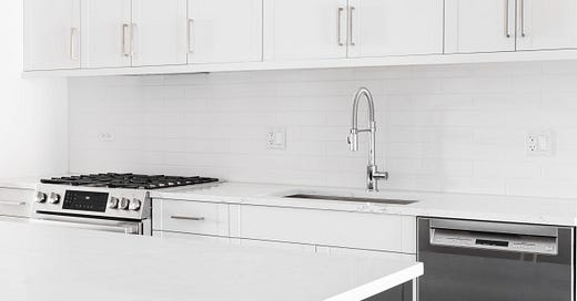
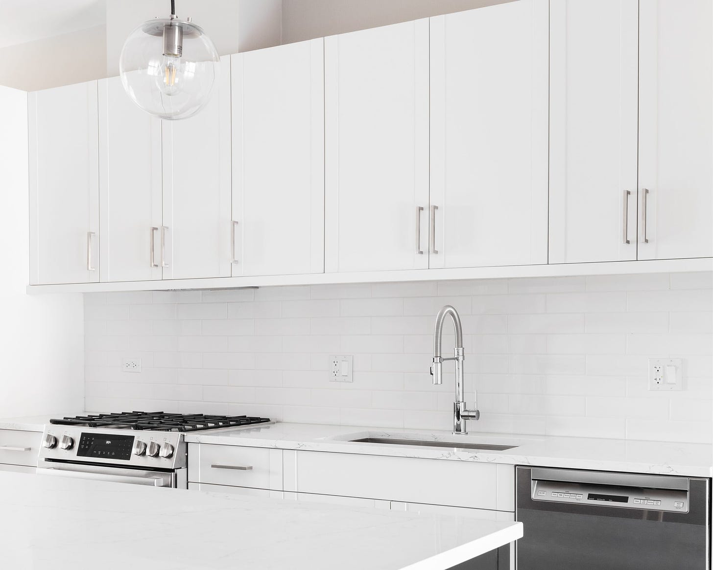
It’s almost impossible to imagine any actual cooking being done in these rooms full of dazzling white surfaces and shiny appliances.
Today’s aspirational kitchen, recognizable across renovation reality shows and internet listicles and realtor photos, is composed on a surprisingly inflexible template. Depending on how much money is involved, the floor may be hardwood, engineered hardwood, or gray vinyl laminate. The layout might be a galley or a square or a formless open floor plan void. But the overwhelming impression is one of gleaming white: gleaming white shaker cabinets, gleaming white subway tile backsplash, gleaming white marble countertops, an enormous gleaming white farmhouse sink, gleaming white walls and trim, all mercilessly illuminated by recessed LED lighting. A gleaming stainless steel refrigerator may break up the endless white. But overall, the ethos of the contemporary aspirational kitchen is the sanitary sterility of a mortuary.
You might be forgiven, looking at so much luxurious hygiene, for thinking we had just escaped from the crowded tenements, or from the eighteenth century’s smoky, cramped detached back kitchens. Clean! Light! Air! proclaim the rapturous magazine copy and real estate ads, with the enthusiasm of a city health official waging the long fight against tuberculosis. Our kitchens may be many ill-conceived and frustrating things, but by God, they will be clean.
The flaws of tubercular design become quickly apparent in the small apartment kitchen. It is easy for a landlord to purchase a few trivial “upgrades” (white paint on the cabinets here, gray granite for the countertops there) and dangle a “clean,” “modern,” “updated” kitchen in front of potential renters—for, of course, a jacked-up rate. Whether or not these upgrades actually make the kitchen better is beside the point. They’re a fait accompli, so up goes the price.
And, in point of fact, they tend to make the kitchen worse. The detritus of personality and life, the cunning adaptations that give small apartment kitchens their flair, do not mesh well with the grays and whites of mortuary chic. They make them look dirty, like day-old snow. The grayscale often clashes with the rest of the apartment, especially if the landlord has stripped away the dignity of walls in the never-ending quest for openness and light. And attempts to bring a luxe touch to the affair—a boxy farmhouse sink next to two feet of countertop—look ridiculous.
But to be fair, every trend, every aesthetic, looks ridiculous when pursued cheaply, thoughtlessly, merely as an attempt to justify a rent hike. To get at the heart of what’s wrong with mortuary chic, you need to see it at its best. At its best, in the homes of the reasonably well-off and reasonably tasteful, the all-white kitchen really does make a pretty picture: pleasant, cheerful, wholesome and glowing. But that is where its virtues shine: in pictures for which it has been scrubbed and composed. The all-white kitchen, by nature, foregrounds and exacerbates every speck of dirt and every irregularity. It requires constant work—not the craft of cooking, but the unending labor of cleaning—to keep it fit to be seen. Its clean tranquility is fundamentally at odds with the household role of the kitchen as a dynamic theater of domestic life, work, and hospitality—and therefore of mess, dirt, leftovers, activity, and bustle. Mortuary chic is, unsurprisingly, inimical to the living.
The aspirational kitchen is already straining under these contradictions. A recent article detailed how some New Yorkers are trying to spend themselves out of the puzzle by building a show kitchen to entertain in, and a back kitchen in which to do actual kitchen things. Rumblings on social media indicate that people are starting to grow sick of the calling card of the venal house flipper: pallid grays and blinding whites. And the wheel of fashion history turns inexorably: Everything is a reaction to something that came before it; everything that is aspirational eventually looks dated. Otherwise a good chunk of the design world would be out of a job.
Kitchens are especially susceptible to this cycle. They feature, as a prominent and usually mandatory feature, cabinetry mass produced to mediocre standards that tends to deteriorate with use. They feature more built-in and jutting out elements—countertops, appliances—on which style and time can be stamped. And because of the simultaneously mundane yet creatively expressive and interpersonally important food prep that we perform in them (aforementioned subset of New Yorkers excepted), they play a part in our whole emotional, social, and aesthetic self-concept that few other rooms can match. It is relatively more difficult for a kitchen to stand the test of time than for a bedroom or office to do so. But some do so better than others.
The inevitable coming retreat from mortuary chic may merely perpetuate the design cycle, which is hungry for moods or looks to yank from their context and transform into aspirational status symbols for all, the real needs of any given aspirant notwithstanding; the decline of one such symbol betokens a hunt for the next. But perhaps we could interrupt the design cycle, at least to some degree. Perhaps we should take a moment to pause. What are kitchens for? What kinds of work and leisure take place in them? What makes a good kitchen? What makes a good kitchen for the real and particular life I lead, in a particular physical context? What do good kitchens share across these living contexts?
Many of architecture’s legends have considered these questions, and I don’t pretend to have come to a final, definitive answer that evaded them. I’m a cook, not a designer. But I have thrown many thirty-guest dinner parties in my apartment, with all the monumental mess and need for logistical efficiency such a project implies. And I grew up in a kitchen that was both diametrically opposite to the current aspirational vision, and formed by the particular aesthetic loves, practical needs, and argumentative opinions of one family, through the nearly unceasing labor of its paterfamilias.
My family’s kitchen is painted a bright yellow that my dad mixed himself. Its stairs are made of wood so old and tired that despite ubiquitous dents and scratches, its orange-brown grain is smooth to the touch, the dirt of multiple generations having been ground into the grooves between the grain to leave a soft patina. There will be no getting rid of that dirt in this lifetime. Wide, dark, glossy-stained pine paneling runs around the walls up to the windows, paneling that my dad designed himself. The cabinets were secondhand when we got them and have not been updated. Some have lost their doors, some are sagging. The counters are small, and there is no island, so much of the work happens on the enormous wooden table that a friend built. Years ago, my parents installed a cast iron gas stove, and in the winter we congregate around it.
There are so many structural eccentricities in that kitchen, built as it was in the early twentieth century. There is much that is frustrating: the cabinets that need replacing, the leak that finally got repaired, the appliances that turn out to be too weak for the Coffey thunderdome. But whenever I return to it, my heart swells with pride: for the beauty, even in the most chaotic moments, of all that warm wood; for the ingenious, beautiful, personal amendments and additions; for the sheer amount of work that has gone into it; for the deceptively intuitive way it invites people in and channels the flow of a crowd in a small space. But most of all, I am proud of that kitchen for the countless meals it has produced, the unending occupation by large and careless groups of children, the constant wear and tear it has been subjected to. And here it still stands: tougher than all of us and getting more beautiful every year.
That kitchen has been the furnace of life in our family, but it has also been shaped in every particular by our family’s life. It has given rise to the two principles of good kitchens I feel reasonably confident about. First, a good kitchen will start with a simplicity and open-endedness that allows for adaptation to a particular life, which means it is incompatible with the design cycle’s total, top-down reimagining of a space to suit a generic vision. Second, a good kitchen is such that its beauty is compatible with, and perhaps even highlighted by, the mess and entropy that accompany real use. A good kitchen will benefit from an occasional deep clean, but it cannot require one to be a pleasant and attractive place. To this end, I am prejudiced in favor of warm woods and earth tones; but more fundamentally, I am opposed to all kitchens, of whatever particular design, that appear, empty and perfect, in the pages of design media. The principle is simple: These have less to do with a good kitchen than a child furnishing a doll house.
Humans need attractive and gracious spaces in which to live and work. But the parameters of that beauty and grace must be fitted to the contours of human life—not to the static products of the industry camera, and not to an imaginary version of ourselves free from biotic indenture with the dirt from which we sprang. Kitchens are for the living, and the living make a mess.


